最近一段时间,准备把ggplot2系统的学习一下,避免做事儿的时候还要临时抱佛脚,临时看help。学习手册就是大家熟知的入门级的《R Graphics Cookbook》,基本上就是在这里记录一下自己的学习历程,并且加入一些自己的理解。那我们就从最简单的条形图开始ggplot2的学习之旅吧!
条形图分为以下几类:
- 简单条形图
- 分组条形图
- 堆积条形图
- 百分比堆积条形图
- 克利夫兰点图
接下来我们就开始详细介绍,先把该加载的包都加上
1 | library(ggplot2) |
简单条形图
简单条形图分为两类,一个是按数值统计的,一个是按数量统计的。
按数值统计
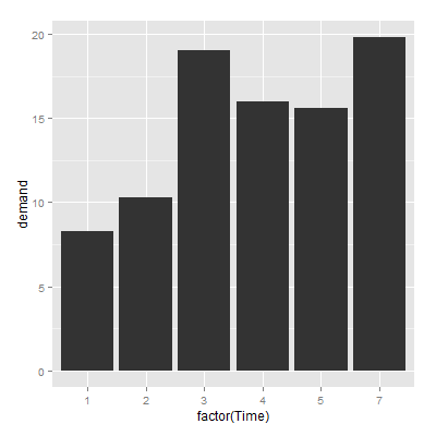
以BOD数据集为例,一列是Time,一列是demand,做条形图
1 | > BOD |
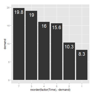
从大到小排序,且加数字标签
1 | > ggplot(BOD,aes(reorder(factor(Time),-demand),demand)) + geom_bar(stat="identity") + |
按数量统计
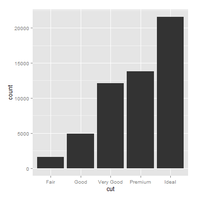
以diamonds数据集为例,格式如下:
1 | > head(diamonds) |
1 | > ggplot(diamonds,aes(x=cut)) + geom_bar(stat="bin") |
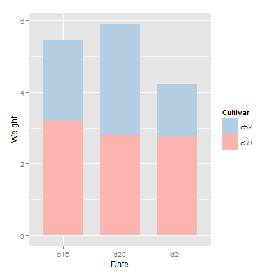
分组条形图
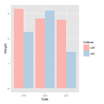
普通分组条形图
以cabbage_exp数据集为例
1 | > cabbage_exp |
1 | > ggplot(cabbage_exp,aes(Date,Weight,fill=Cultivar)) + |
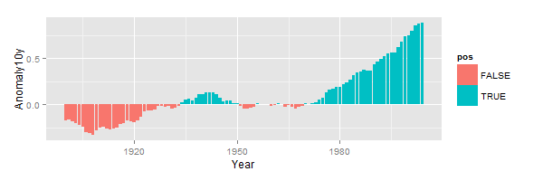
正负分组条形图
设置一列pos为正负条形的位置
以csub数据集为例
1 | > csub = subset(climate,Source=="Berkeley"&Year>=1900) |
1 | ggplot(csub,aes(Year,Anomaly10y,fill=pos)) + |
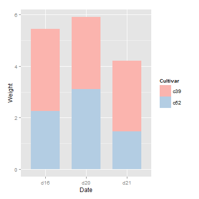
堆积条形图
还是以cabbge_exp数据集为例
1 | > cabbage_exp |
1 | > ggplot(cabbage_exp,aes(Date,Weight,fill=Cultivar)) + |
上个例子用reverse=TRUE来更改legend的顺序,现在用order=desc来解决
1 | > library(plyr) |
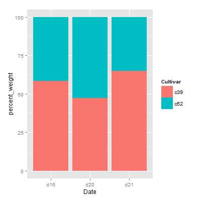
百分比堆积条形图
以ce数据集为例,增加百分比列
1 | > library(plyr) |
1 | ggplot(ce,aes(x=Date,y=percent_weight,fill=Cultivar)) + |
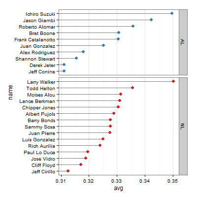
克利夫兰点图
Cleveland点图是条形图的变种,有时候比条形图更清晰,以tophit数据集为例
1 | > tophit = tophitters2001[1:25, ] |
1 | > ggplot(tophit,aes(x=avg,y=name)) + |
小贴士
以后在小贴士这个栏目里,会发布几个平时不太注意到的函数或者是小方法,苦逼的生活就是 “哎呀,太TM累了,看会儿R手册歇会儿吧”。
example()函数
example()可以允许例子的代码,比如example("seq"),example("ggplot2")等
help.search()函数
help.search()可以查自己不太确定的函数,比如想做个时间序列分析,可又忘了怎么做了,可以试着help.search("time series analysis")